


The Individual House. Part 2
Description
This section is from the book "Interior Decoration: Its Principles And Practice", by Frank Alvah Parsons. Also available from Amazon: Interior Decoration: Its Principles and Practice.
The Individual House. Part 2
It matters not in what field one works, conscious, constant right choice and right usage is good taste. Just as one improves in manners by habitual practice, though a tendency to these may be inborn or not, just so one improves his taste in colour by habitual choice and use of the best within his knowledge.
Let us not be satisfied, then, with any expression that happens to come along which rests the body, gratifies sentimentality or seems cheap. Be willing to go without rather than have a bad thing and one will grow in good taste.
Many who would not talk too loudly in public or parade their own personal grievances in conversation do not hesitate to do so in a living-room or dining-room. Further analogies might be given, but this is sufficient for any one to see that rooms, except very personal ones, like bedrooms or boudoirs, are not the places in which to exploit one's idiosyncrasies. Impersonal treatment of impersonal objects will seem personal enough to the varied kinds and types of people who must come and go in the ordinary room.
In every problem, however, there are certain things we shall call them premises - that may well form part of the foundation plan for decorating any room.
No one of these is more important than geography.
Any room in Florida presents a different problem from the same room in the Adirondack Mountains. The town house with its imperfect light, coming, perhaps, from two directions, perhaps one, is quite another problem from the country house with its open fields and adequate light from all sides. The problem of the house on the hill and the one in the valley presents two different aspects in the matter of colour and form. Trees close to the house, dense shrubbery and other objects change the plan from the very outset.
In the hot, sunny South there is the problem of getting air and excluding the burning sun. In the extreme North there is the air to come in but cold to be kept out while the sun is admitted. This has a decided influence on the placement, size and number of windows, and the location and arrangement of doors, halls and the like, and also upon the shutters, hangings and window accessories.
The side of the house on which the room is located is also of importance. The south and southeast, with their almost continuous sun, call for a choice of cooler colours. The northwest, on the contrary, with its generally cold gray light, requires warmer and more luscious colour than the southeast, or even the southwest, of the same house.
This is a matter of function only. The Southern house must be comfortable perhaps the year round, with the temperature above normal. It must not only physically and structurally be so made that air can be easily circulated without admitting too much heat or light, but colour must be chosen which is an antidote or complement to the extreme heat of the atmosphere. Warm rich reds, oranges and yellows are inappropriate where the temperature expresses the same quality. Greens, blue greens, blues, violets and some yellows may be used in warm temperatures.
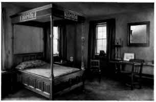
A SUCCESSFUL ADAPTATION OF THE LATE GOTHIC AND RENAISSANCE IN A MODERN CITY HOUSE, RESULTING IN THE EXPRESSION OF EXTREME REFINEMENT, SIMPLE ELEGANCE AND PERFECT TASTE. PERSONAL.
The reverse of this is true in the Northern house, in which the climatic conditions are directly opposite, and something of the same result is sought. Make colour do the work which the climatic condition does not; let it act on consciousness as a supplement to what is being forced on us through the senses. This is what colour is for. Its function is to stimulate certain ideas in the mind, either consciously or unconsciously. Thus it produces a pleasurable aesthetic sensation and also has a neutralizing effect upon other sensations.
The city house must be treated in colour in precisely the same way: the north side in warm colours, the south in cooler. This does not mean that full intense colours, or even half intense, in any of these tones must be used, but it does mean that if the cool colours dominate in the southern exposures and the warm ones in the northern exposures, there is a feeling of equality, consistency and harmony in the house unit that cannot be obtained otherwise.
This rule has many modifications. For example, some persons must have more intense colour about them than others. Some believe they cannot exist unless they have a blue, a red or a green room, believing that, temperamentally, they require something of the kind. There are many other things that influence this general statement but, in the main, the rule should be followed.
If one is to spend only the summer months in a country house, and if the climate during that time is warm, nothing is more helpful in obtaining comfort than rooms in light, cool colours. Let the blues, greens and their hues dominate; let the yellows be neutralized to an old ivory, and introduce only sufficient warm colour to give the personal and exciting note necessary to vitalize the room.
These general geographical situations are the first thing to consider in furnishing and decorating any room in the house. A decorator or an owner who attempts to select a trim, a wall paper, or a rug without first asking himself how many windows there are in the room, from what direction the light comes, how much sun the room gets, and what part of the day it gets it, has omitted the one thing which will help him to decide on a right background. On the other hand, it is as essential to know whether a room is to be used during the entire year or a portion of it, and whether sunlight is obscured by nearby bushes or other buildings, as it is to know whether it is a dining-room, a bedroom or a living-room that is to be furnished.
Continue to:


My Books