


Colour And Its Relation To The Decorative Idea. Part 2
Description
This section is from the book "Interior Decoration: Its Principles And Practice", by Frank Alvah Parsons. Also available from Amazon: Interior Decoration: Its Principles and Practice.
Colour And Its Relation To The Decorative Idea. Part 2
All of us have seen blue turn to green when seen under artificial light. We have seen violet almost become red, and another tone of violet appear gray. These are perfectly natural changes, and are due only to the effect which one element in colour produces on another when used in connection with it. Bad colour schemes could easily be avoided if we knew the power of each of the elements concerned.
A DESCRIPTIVE COLOUR CHART
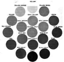
THE OUTER CIRCLE SHOWS THE NORMAL, FULL INTENSE PRIMARIES, BINARIES, AND HUES.
THE INNER CIRCLE SHOWS HALF-NEUTRALIZED PRIMARIES AND BINARIES AS THEY APPROACH THE BACKGROUND POSSIBILITY. OPPOSITE TONES IN THE CIRCUIT ARE CALLED COMPLEMENTS.
It is wise at this point to differentiate between colour as the physicist uses the term in connection with colour in light, or as component elements of pure white light and the pigment colour so called, which includes dyestuffs, printers' inks, oil and water-colour paints, etc. These pigments are materials which absorb a part of each ray of light and leave the remaining part on the surface, giving the impression to the eye of the colour which one sees when he beholds any object.
In terms of general understanding there are three elemental pigments which express the three primary elements of colour found in white light. In pigment terms these three elements are called yellow, red, and blue, and are the primary colours in what is known as the colour spectrum. When these normal elements are in their fullest strength they are easily fused by mixing into a neutral gray in which no apparent colour is seen. This gray, eliminating all colour, is the proof that the three elemental pigments are the foundation of the colour language and that their fusion into gray is the translation of the rainbow spectrum into light.
Starting then with yellow, red, and blue of normal tone, all other colour tones, with the additional use of black and white, may be made. Because of this, yellow, red, and blue stand out as the simplest, most primitive, least involved, and most easily grasped of all colour tones.
It is easy to understand why young children, primitive races, and persons with an obtuse colour sense can without conscious effort appreciate yellow, red, and blue in their full brilliancy and in limitless areas. A more refined sense or a greater range of colour possibility ignores this crudeness, except in cases of extraordinary emphasis for very particular reasons.
Green as a normal colour is one-half yellow and one-half blue in force; orange is one-half red and one-half yellow; purple is one-half red and one-half blue. These three colours, because there are two elements involved in each, are called binary colours, and these, since they contain two elements each, are less easily grasped, require a more cultivated sense, and express a wider range of quality idea.
With these six colours in mind let us examine the fundamental meaning of each. A colour tone should by its very nature mean a quality, and should arouse in the individual the feeling of quality, and not merely excite a feeling of pleasure or bring up by association the colour name.
Yellow is more than any of these like the sun or artificial light in its appearance. In fact, it is very like most artificial lights, and like the sun when one looks directly into it. Because of this, yellow is called light, and just as light brings cheer into the darkened room, just as it gives life to plant forms, just as its life-giving and cheer-giving qualities are seen in other manifestations, so yellow, entering into any colour scheme whatever, introduces into it the same quality feelings of light, cheer, buoyancy and life.
The darkened city room, with its one window opening on a court, may be made livable and usable by means of a yellow wall paper, with a lighter, softer, yellow ceiling. Then, by bringing light yellow into the hangings and using yellow lamp shades lined with white, all the light will be conserved. The natural and artificial lights will be supplemented by the colour, and the qualities which light itself has will be forced into the scheme of the room. To forget the power of light in room arrangement is to forget the fundamental fact in all colour use. This does not mean that in any of these cases a perfectly full, intense, brilliant yellow should appear, but a colour tone, in which yellow is the dominating element. Such names as buff, cream, ecru, lemon, etc., are given to yellow colour tones in which yellow is the dominating element.
Red suggests blood and fire - blood as it relates to the life-giving or vitalizing force in man which makes him think more quickly and act more quickly - which arouses his passions, and creates ideas of warmth and irritation. This is particularly true because persons have been born and have lived with blood red in colour and with fire red in its dominating element. We know by life experience the effects of such things on the actions of man.
This quality of aggressive action on the part of red is curious in its effect when used in excess. Some two years ago in a large department store a small room was built and coloured throughout a bright normal red. A jury of six men was invited to estimate the size of the interior. The same room was removed to another part of the store and coloured in light clear blue. The same party of men was asked to estimate the size of this room.
They estimated the latter to be over thirty per cent, larger than the former, and refused to believe that the two rooms were identical.
Red, by its aggressive nature, seems to reach man's consciousness more quickly than blue and, therefore, the walls and ceilings seem to contract or to be brought closer together, thus lessening the apparent size of the room. The effect that red has upon animal life is well illustrated by its use in exciting the temper of the bull in the Spanish bull ring, the turkey gobbler on the New England farm, or the savage beast in the jungles of the African forest. This exciting quality which red possesses is a valuable asset for use in stage settings where the primary object is to create a state of emotion in the audience in harmony with the incident which the actors wish to force on public consciousness. Those who have seen Miss Nethersole, Mrs. Patrick Campbell, or Mrs. Fiske in any of their pronounced successes can readily see how the use and the absence of this colour have played a large part in the creation of an atmosphere calculated to convince the audience of the idea which the play portrayed.
Continue to:


My Books