

Chapter IV. Emphasis And Unity
Description
This section is from the book "Interior Decoration: Its Principles And Practice", by Frank Alvah Parsons. Also available from Amazon: Interior Decoration: Its Principles and Practice.
Chapter IV. Emphasis And Unity
PURPOSELY up to this time no special stress has been laid upon those qualities in objects which furnish the power of attraction previously mentioned. There are several elements which in themselves attract the eye under ordinary conditions. There is probably no doubt that colour is the most attractive of all forces to the eye because colour is the only thing the eye sees - forms and lines being the result of colour transition and mental comparison.
Colour may be used as an attractive force in three fields, that of hue, value and intensity, and should be balanced accordingly. If one colour presents with its background a very strong contrast in intensity, this appeal may be balanced with another object which is a stronger contrast in value.
As has been shown in the chapters on colour, one estimates, consciously or unconsciously, the attractive power of a colour tone in each of the three fields, hue, value and intensity, and the more one studies a balanced relation of these qualities under varying conditions, the finer becomes his sense of discrimination, and the sooner will the feeling for balance become a habit. Until it does become a habit the pleasure resulting from balanced relationship cannot be felt by the individual, for the final test of aesthetic appeal is in the power of significant colour combination or of form to stimulate the activity of the aesthetic sense.
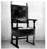
AN ITALIAN CHAIR WHOSE LINES CREATE AN OPPOSITION IN MOVEMENT, RESULTING IN A CLEAN CUT, DIGNIFIED, FORMAL STRUCTURE, WHOSE PRO-PORTION IS ITS CHARM.
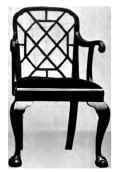
A CHINESE CHIPPENDALE CHAIR WITH MIXED LINE ARRANGEMENTS, CREATING AN OPPOSITION IN THE BACK, DISTRACTING AND UGLY, AND RESULTING IN PROPORTIONS IRRECONCILARLE.
When objects are to appear as decorative features in colour upon a cabinet, bookcase, shelf or table, there is abundant chance for arranging two, three or five objects differing in colour, size and form. If there are five objects there is a single one, with two on either side, arranged in such a way that there is a perfect feeling of rest in the arrangement. No finer training is possible than the arranging of such groups.
If the objects differ considerably in colour, perhaps in hue and intensity, the problem is still more interesting. If there is also great variation in value the problem is too involved to grasp easily.
Two of the three qualities of colour make sufficient contrast between objects that are to be considered as parts of a unit, and even these two should not under general conditions be too violently contrasted. It is a good thing to cultivate the habit of seeing subtle relationships and allowing subtle relationships to do the work under ordinary circumstances. Never use violent contrasts in any of the colour qualities except as understood emphasis necessities, or as consciously felt stimuli to the colour sense.
A judicious use of colour is essential, as a judicious use of anything else is essential, to its fullest usefulness. An orgy of colour, like an orgy of other natural qualities, unfits one to appreciate its force and exhausts that force in unnecessary activity.
Contrasted shapes must be balanced. A round form appearing against an oblong wall makes a stronger bid for attention than an oblong form of exactly the same area and exactly the same colour as the circular one. Some power of attraction added to shape must be given the oblong form before it can make as strong an appeal as the circular one or become a balance for it.
In sensing an occult balance this must be considered as well as relative sizes. All other things being equal, objects of the same size present the same attractive power. Sometimes, however, a small object, brilliant or intense in colour, may be balanced by a much larger one less intense in colour, when other attractive forces are the same in each.
Texture, too, has a special attraction interest. When the wall is of a soft, flat, smooth texture, and two pieces of pottery are to appear on it, one having almost exactly the same feeling in texture as the wall and the other contrasted by being much coarser, heavier, rougher and more porous in appearance, even if size, shape and colour are identical, the contrasted texture gives one a stronger force appeal than the other. This quality of textural difference is a matter for consideration later, but one that seriously enters into the perfect feeling for balanced arrangement.
The principle known as movement is, in composition or design, the opposite of balance and destroys the idea which balance creates.
When the human figure stands erect - ears, shoulders, hips and heels in the same vertical line - it is in harmony with the law of gravitation and is at rest. No effort is required to stand erect when one is in this position.
The law of gravitation does the work. If the body is laid flat upon the floor the same law, acting on the floor, the body and the rest of the universe, makes action or effort on the part of man unnecessary. Stand and incline the body forward by throwing the left leg out as if to run, and the body assumes a position in which there is the appearance of its being about to perform some act requiring motion. If it were to tip back of the vertical line the same feeling would be created, and an effort be required in order to remain in this position. The figure thus posed is said to be in action.
When an inclined or oblique line appears in composition with vertical and horizontal ones, the same feeling of action or motion is expressed. This is because it is out of line with gravitation and out of line with the structural ideas with which it is in composition.
Continue to:


My Books